· 4 min read
Before the first step: menus, options and accessibility
Every game starts with screens nobody talks about, until they go wrong. Menus, options, controls and what I test along every path.
Before there was a character walking around, the game already needed a beginning: the opening, the title screen, the main menu, pause, the options, saving and loading. Nobody praises a menu that works, but everyone remembers the one that deleted the wrong save. I didn't want to be that game, so that's where I started.
Options in five tabs
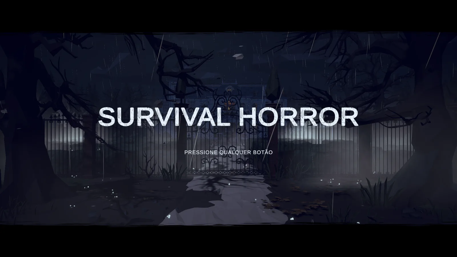
Right now the options live in five tabs: gameplay, controls, display and graphics, audio and language, and accessibility. Every line explains at the bottom, in one sentence, what it changes, because an option with a fancy name that nobody understands doesn't help anyone. You can reset a single section or everything at once, and the whole game already exists in Portuguese, English and Spanish.
Accessibility isn't just one tab
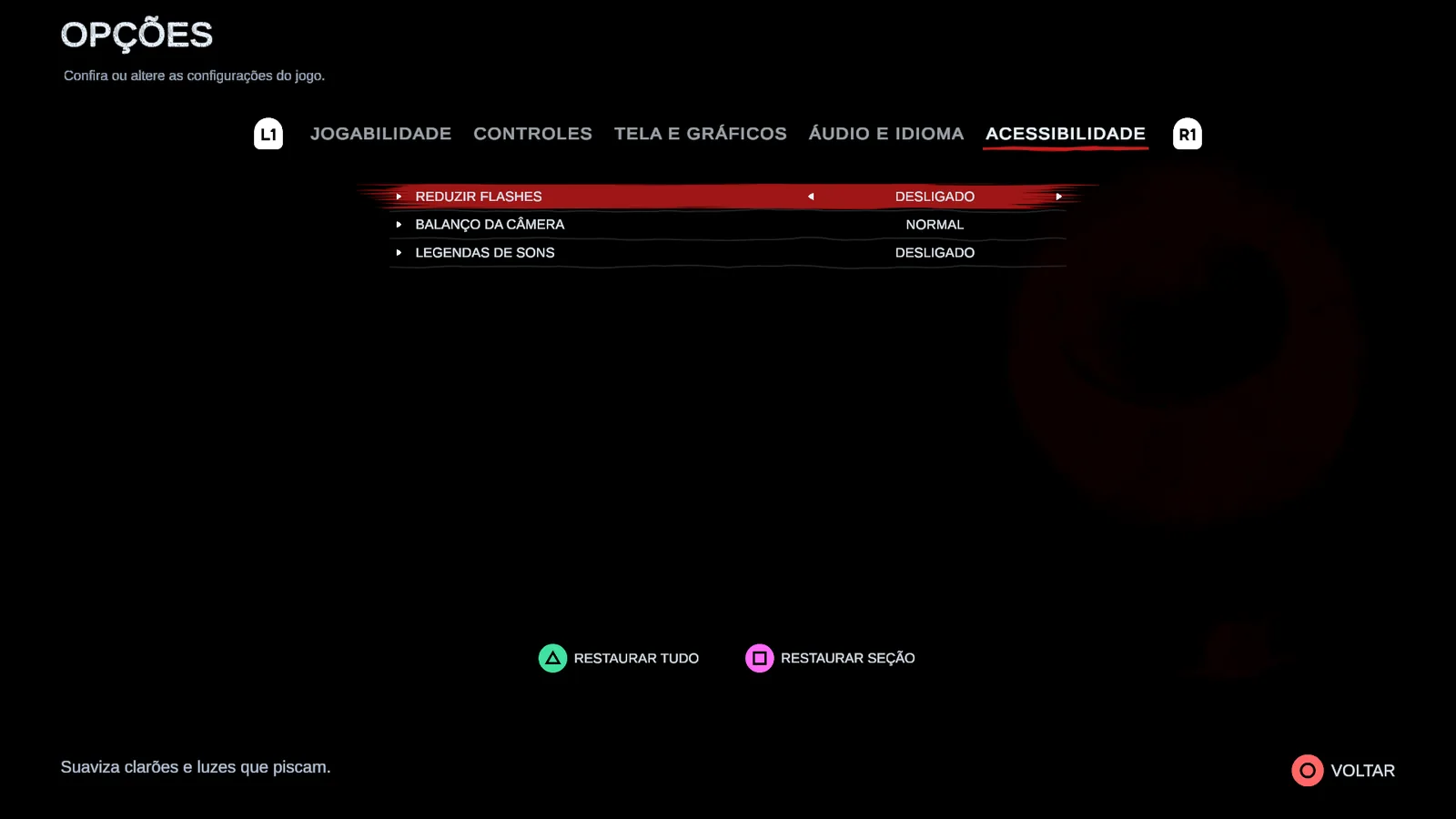
It has its own tab (tone down flashes, reduce camera sway, caption sounds), but it doesn't stop there. The text size applies to every menu, and I checked every screen with the text at the large size, because an option is useless if the screen breaks when you use it. Subtitles have a live preview, with the color and background you want. And brightness got a screen of its own, from 0 to 100, with a mark that should be almost invisible at the right setting.
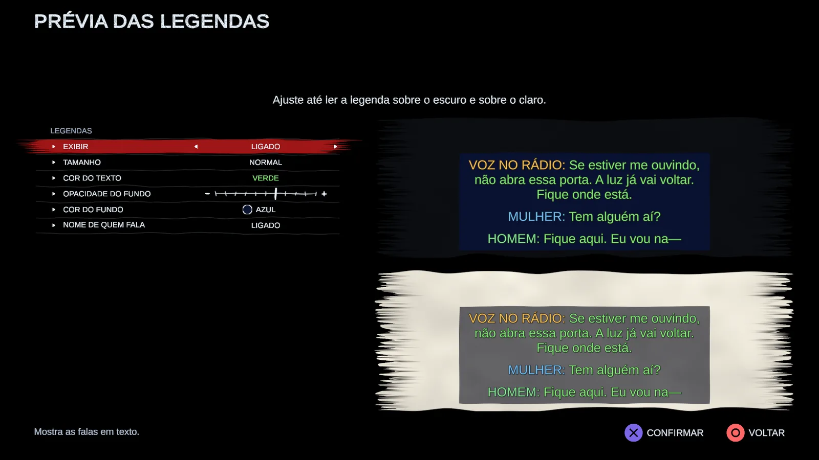
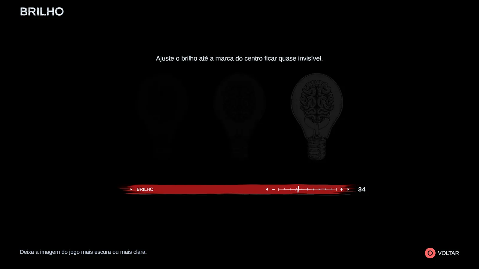
Building these screens was, first of all, a learning experience. An options screen looks simple and hides a pile of decisions, from where each choice is stored to how it changes the game on the spot. But what drove me was something else, and still is: finding more and more options, for customization and for gameplay, so everyone can tune the experience their own way.
Three ways to hold the controller
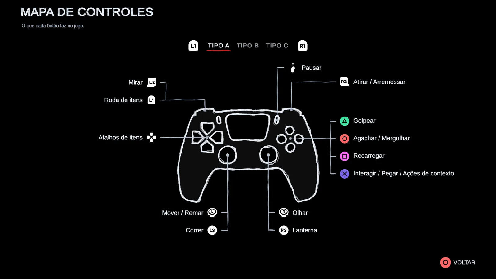
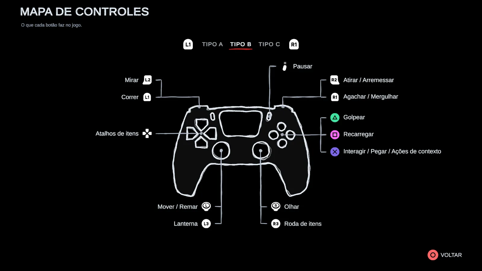
There are three control schemes, and each one has its own drawn map, with the button for every action in the right place. Button icons follow the controller you're using, so nobody has to memorize which one is the "bottom button".
What you might lose, you know beforehand
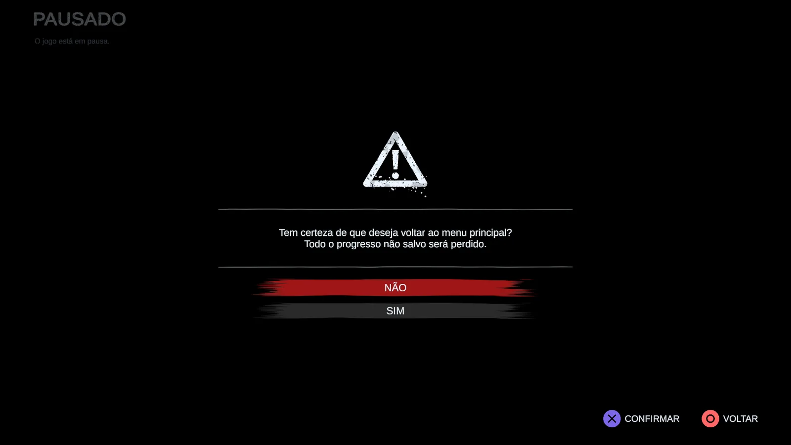
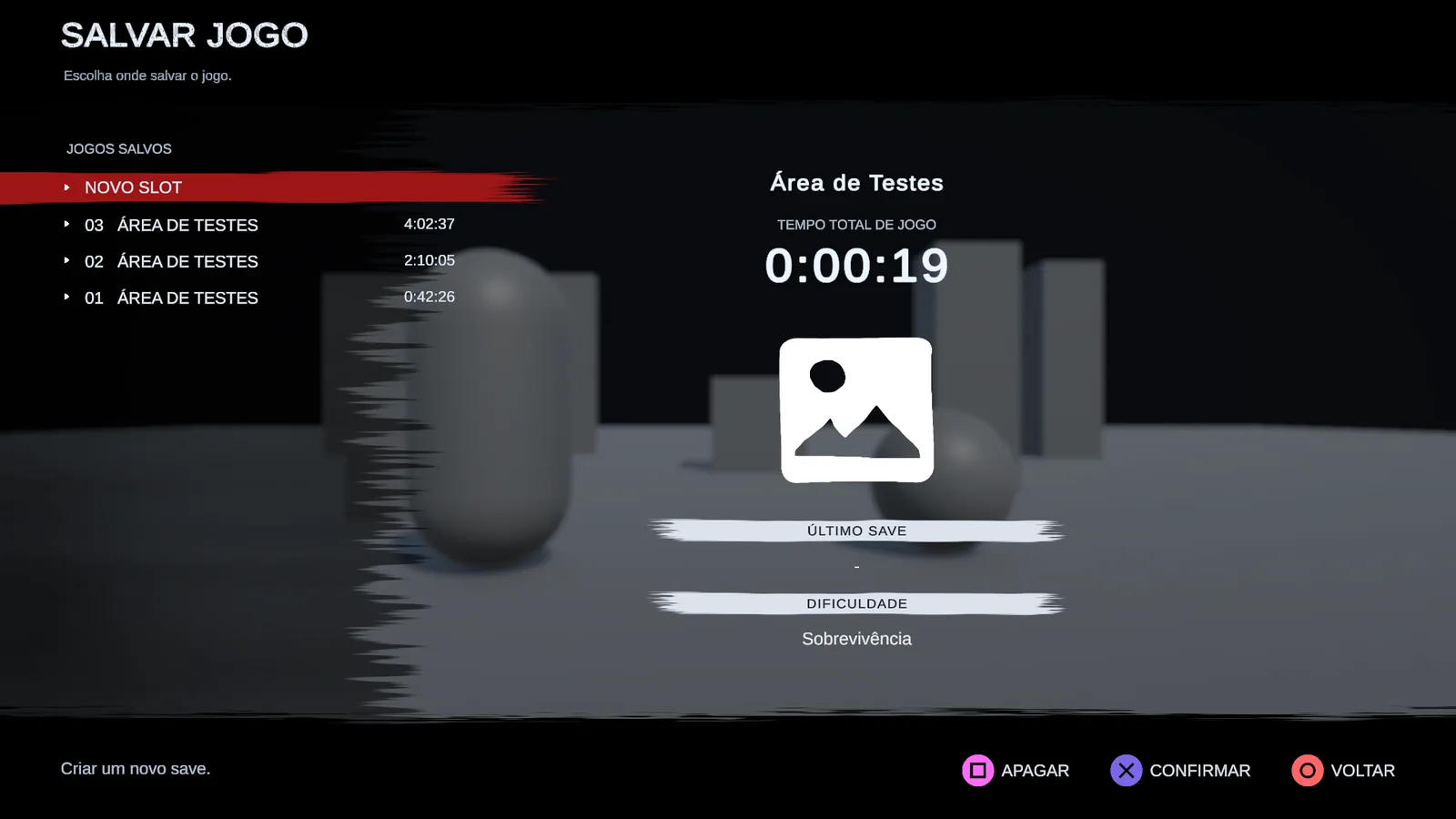
Every action that throws something away asks first, says what will be lost and starts with "No" already selected. Losing progress because of a button pressed by accident is one of the most frustrating things a game can do, and I didn't want that here. Saving shows the slots, the chapter and the play time, and autosave and checkpoints let you know when they save.
Validating the paths
Working alone, there's no way to click through every path by hand after each change. So I let the editor do it for me: there are checks that walk through the menus, open and close every confirmation, check the translations and any text that doesn't fit, and test saving without ever touching my own save files. When one of them finds a broken path, it never reaches you.
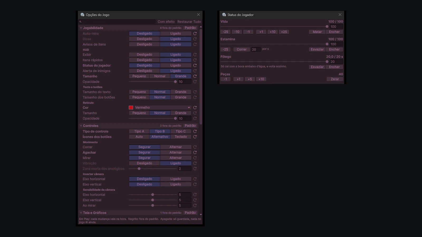
And there was one thing that really wore me out: stopping the game, changing an option, hitting Play again and getting back to where I was. So each part got its own panel inside Unity. In the options one I change any setting while the game runs and see right away what's off the default. In the status one I fill or drain health, stamina and breath with a click, without taking a beating until the screen I want to test shows up.